Wisconsin Conservation Voices Redesign
Wisconsin Conservation Voices needed a redesign of their Native Vote page to better explain the program, highlight the impacts, and engage Native audiences with the users in mind and a redesign of their Voting Info page to make voting instructions clearer, more accessible, and easier to navigate.
UI/UX

Project Overview
Client: Wisconsin Conservation Voices (non-partisan, focused on Wisconsin's communities)
Industry: Non-profit Advocacy Group
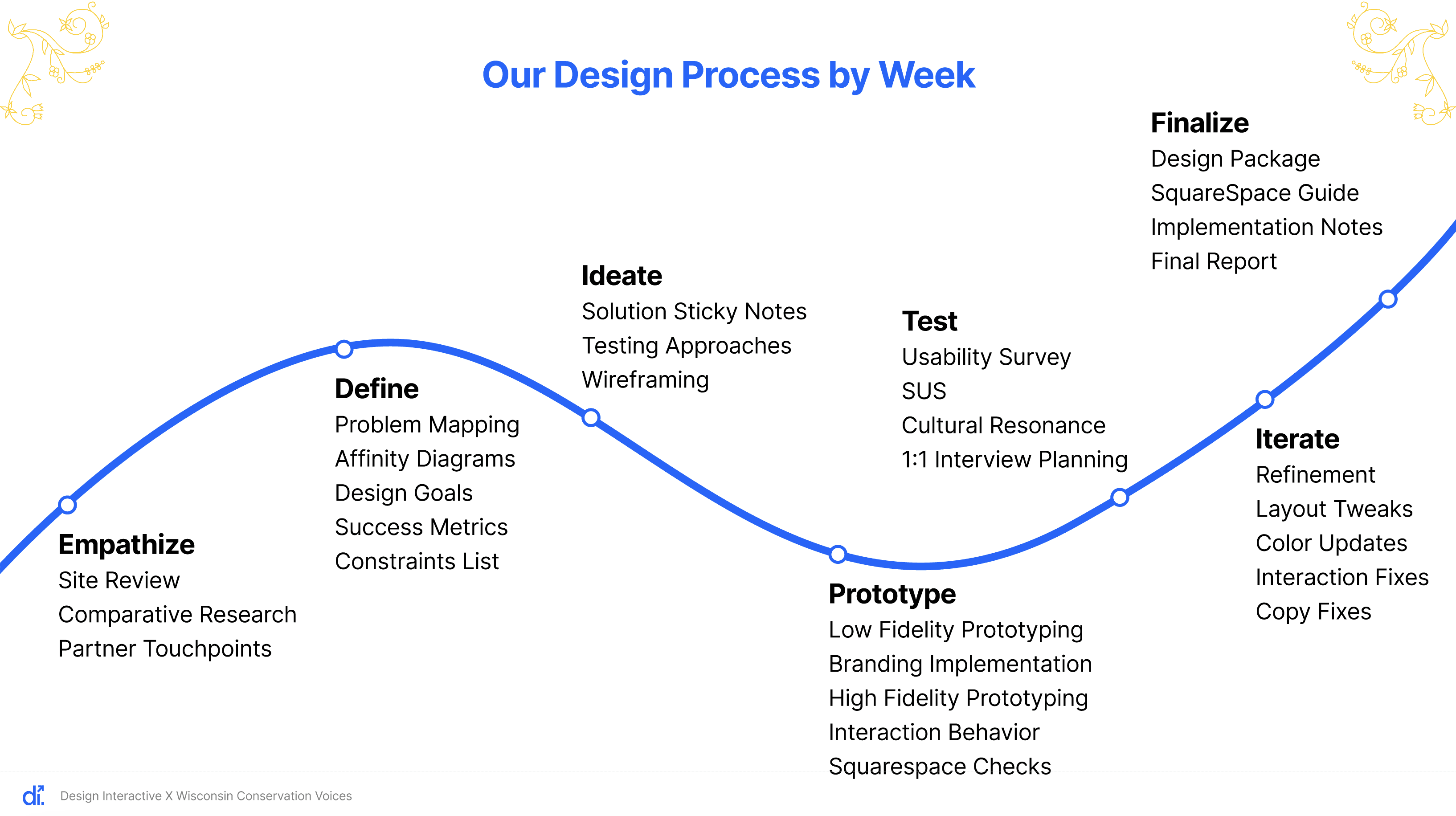
Timeline: 8 weeks (2025)
My Role: UX Designer
Redesigned the Native Vote page to explain the program better, highlight the impacts, and engage Native audiences with the users in mind. Redesigned Voting Info page to make voting instructions clearer, more accessible, and easier to navigate.
Throughout the project, we worked within our constraints and made sure every recommendation could be realistically implemented on Squarespace.
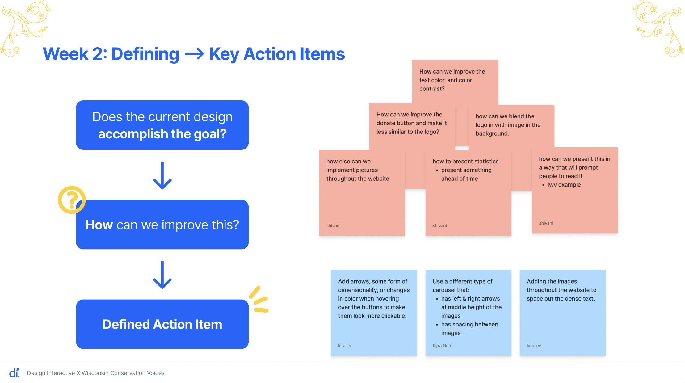
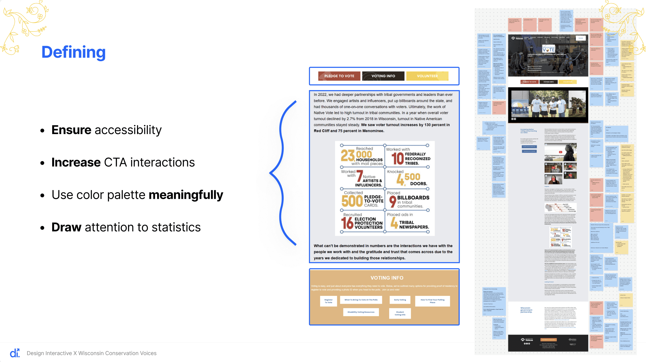
So now, when we look at the site, our goal is to take into consideration whether the current design accomplishes the goal, and if not, we move to thinking about “How can we improve this?” From there, we identify our key action items.
Our Focus:
Understand how people experience the current pages
Identify what worked well, where users struggled, and what felt overloaded.
Our Goal
Make the website easier to understand, quicker to navigate, and more supportive for the people who rely on it
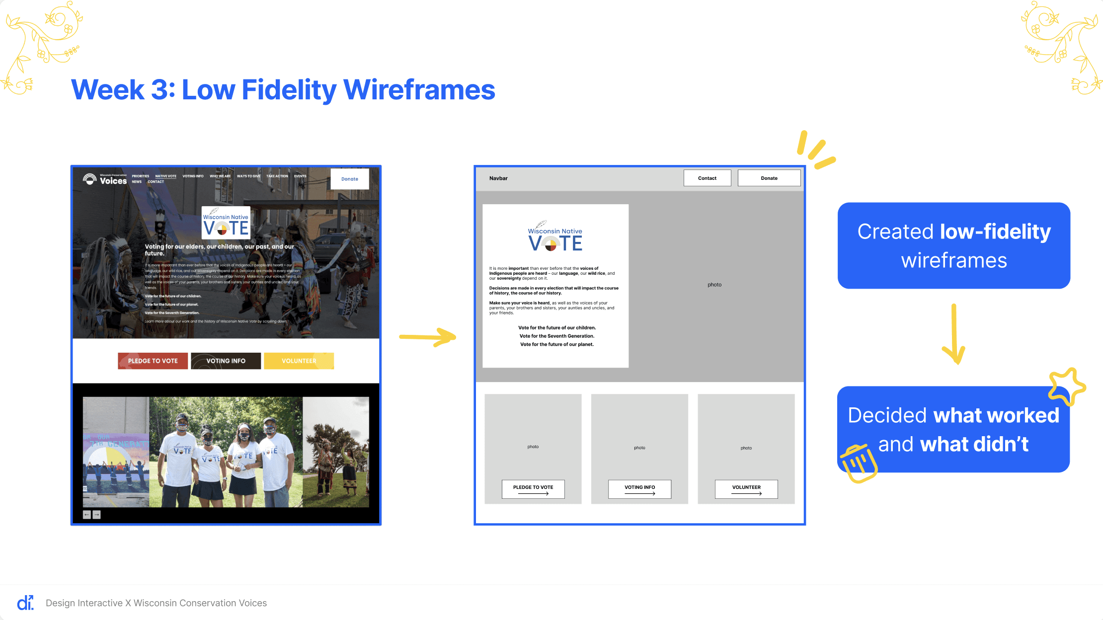
For Week 3, we focused on creating and refining our low-fidelity wireframes. We explored multiple layout variations for both the native vote and voting information pages, comparing how each structure supported clarity, visual hierarchy, and overall user flow.
Key design changes:
Moving the heading layout to a white background to better match the logo
Improving accessibility through stronger contrast and readability
Retaining the header image to support the page’s narrative without competing with the main content
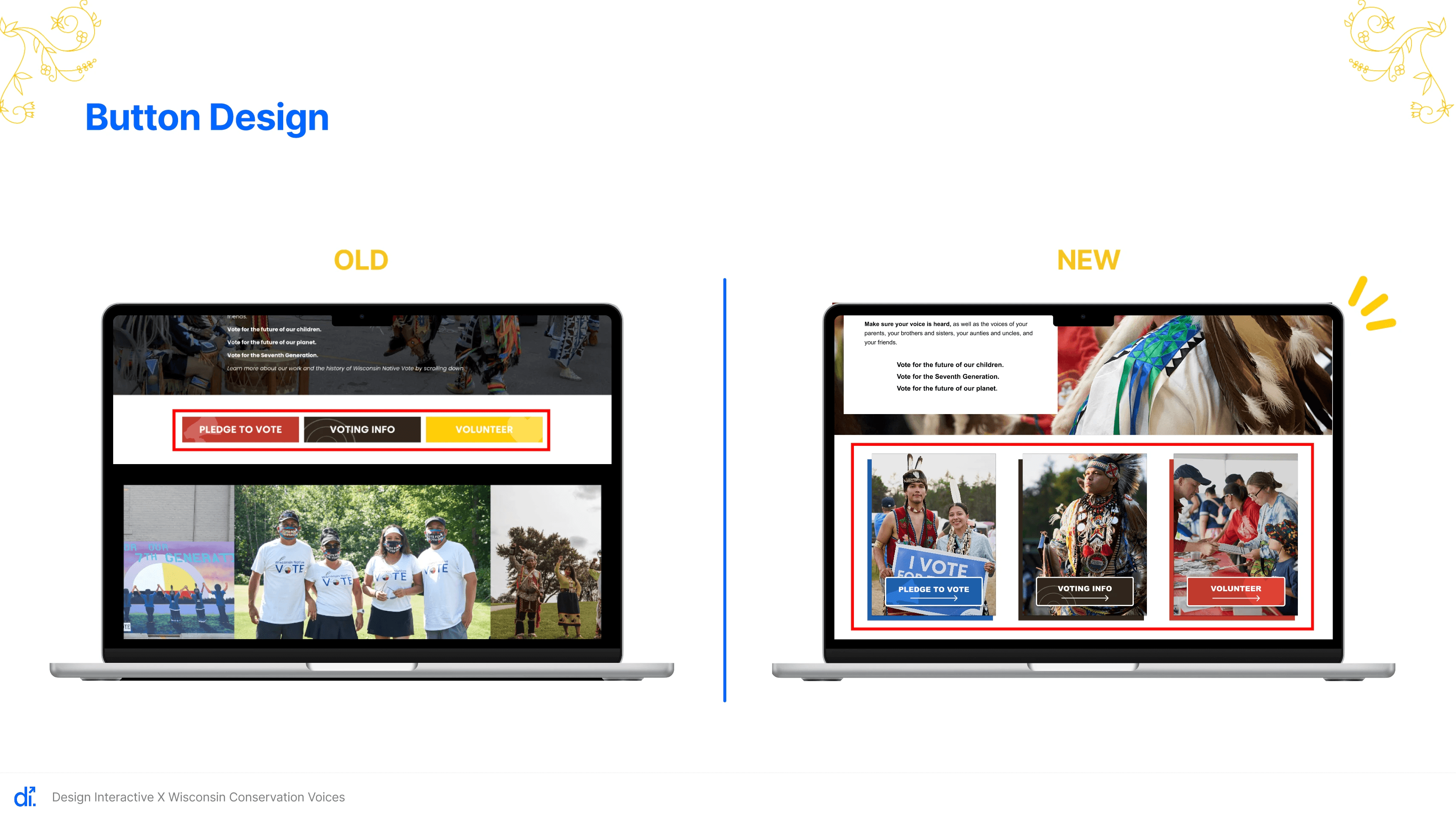
We also re-evaluated how carousel images were used. In earlier versions, the carousel felt disconnected from the layout, so we adjusted the design to create a more cohesive experience.
Updates:
Enlarging and repositioning key call-to-action buttons
Integrating supporting images more intentionally with user actions
For this week, we moved from low-fidelity to high-fidelity prototypes. After discussing our designs with the cohort and partner, we refined the color palette, typography, and buttons, and introduced yellow accents to strengthen visual consistency and meaning across the site.
Refining the color palette based on cohort feedback
Adjusting typography and button styles
Yellow accents throughout the interface
For color choices, we followed the brand guide inspired by the Medicine Wheel in the Wisconsin Native Vote Logo, assigning each color a clear purpose:
Red: used for statistics and calls to action
Yellow: used for accents and secondary emphasis
Dark brown: used for high-contrast color blocking
Blue: used to emphasize connection and social links
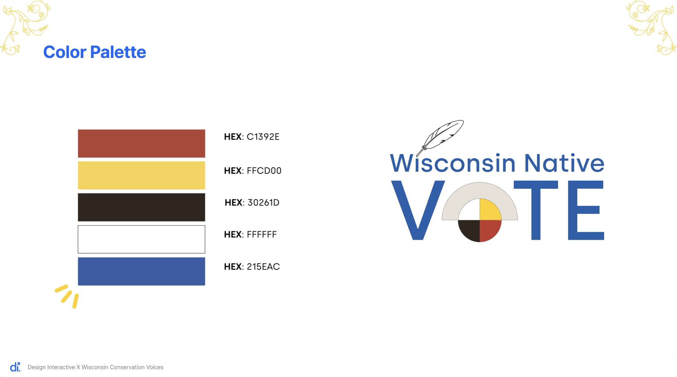
We created multiple color combinations and compared them side by side to determine what felt most cohesive. Initially, we relied heavily on red, white, and blue, but realized this made the site feel overly patriotic. To better align with Native American culture, we shifted toward a stronger use of Medicine Wheel colors.
Typography Changes:
Reducing subheader font size from 39 to 36
Increasing body text size from 17 to 18 with 150% line spacing for better readability
Primary CTA Buttons:
Incorporating images into primary CTA buttons that change color on hover
Yellow to blue to improve accessibility and visibility with white text
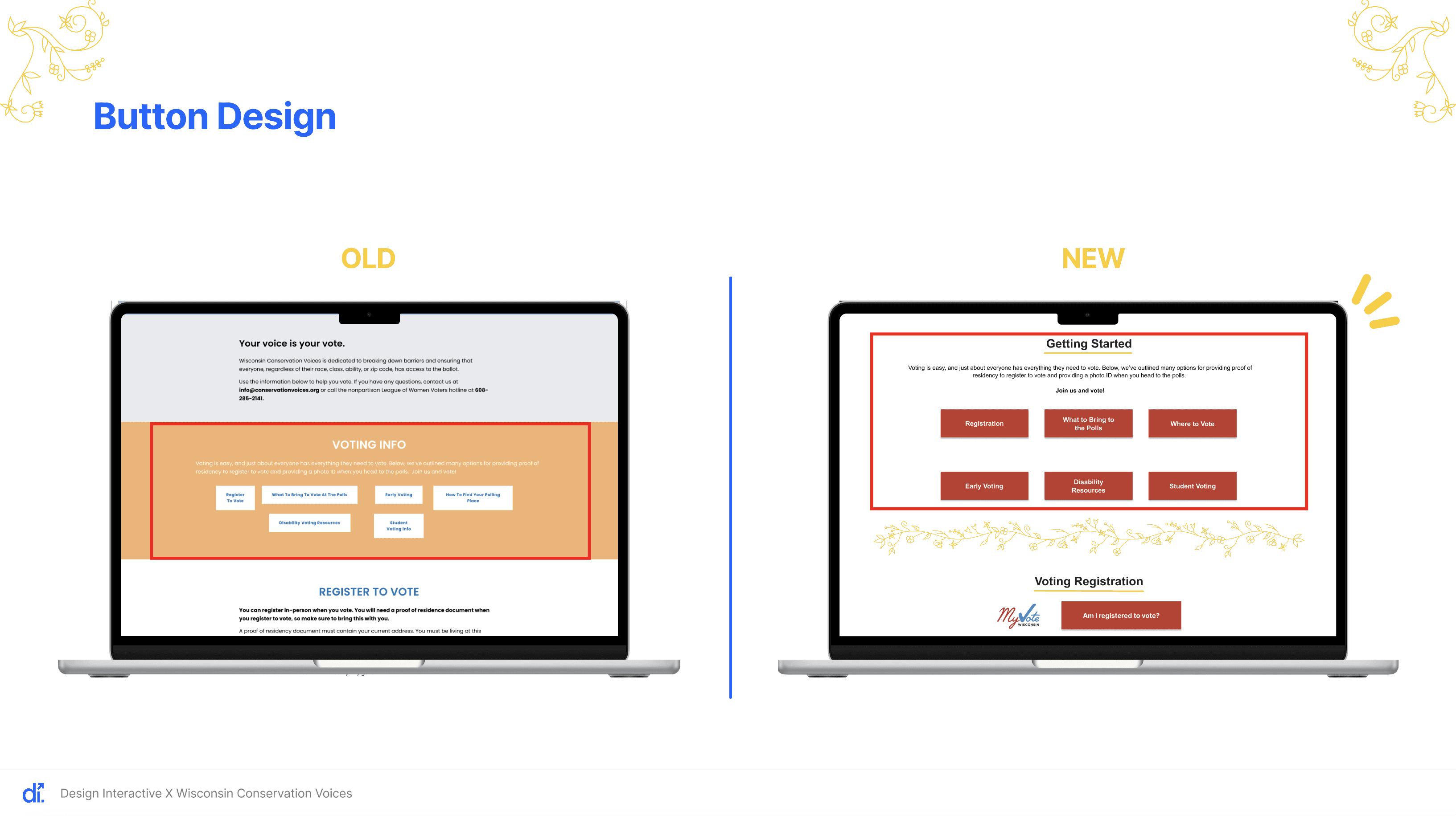
For the Voting Info section, we focused on consistency and accessibility:
Improved button colors for better contrast
Kept six buttons but standardized their size
Used brown titles with yellow underlines to align with the Medicine Wheel palette
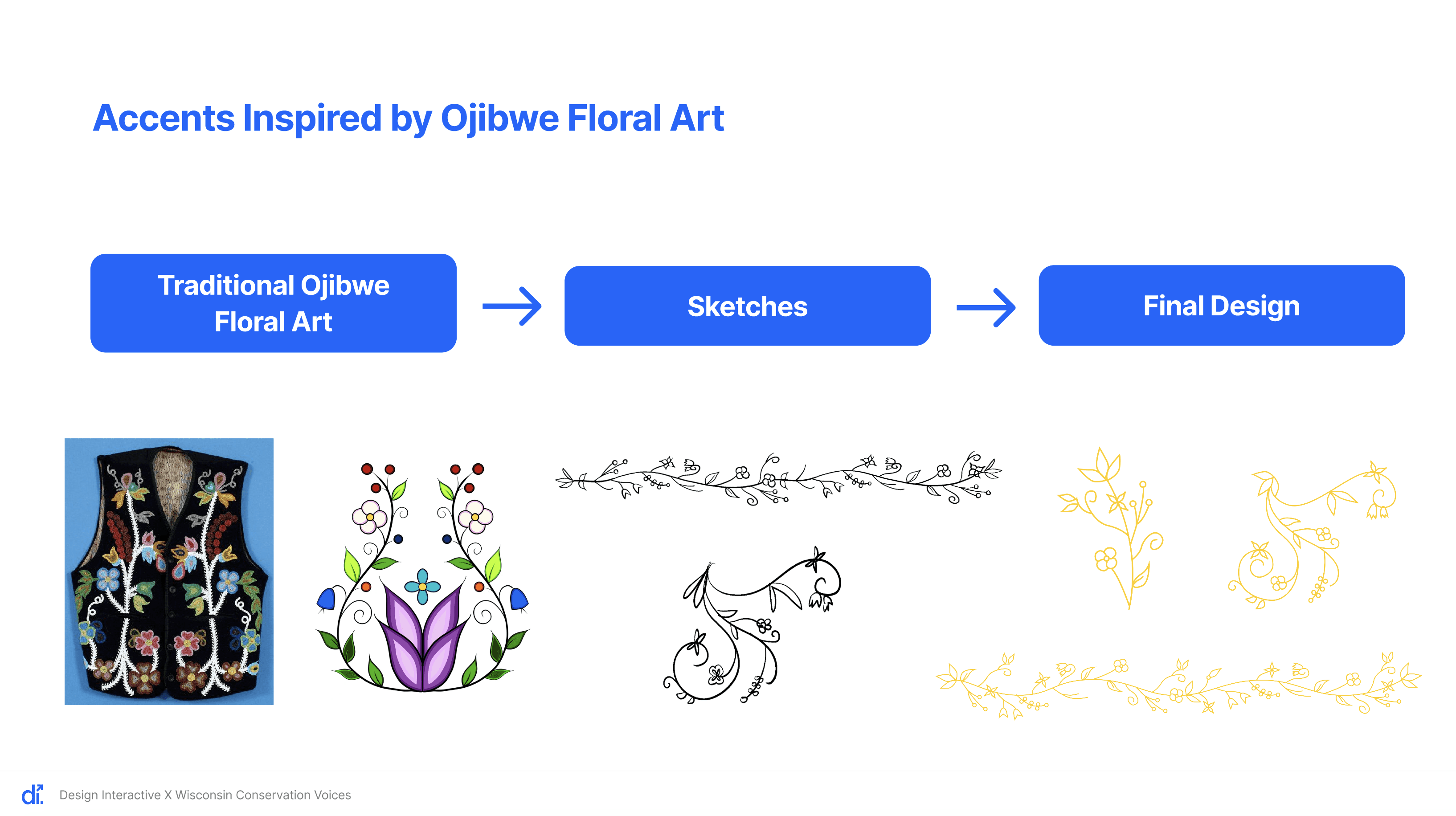
These accents are inspired by traditional Ojibwe floral art, which features circular, flowing, vine-like patterns and symmetrical, balanced compositions. Since the Ojibwe people are Indigenous to Wisconsin and southern Canada, these visual elements help the design feel more connected and meaningful, while adding warmth and cohesion to the interface.
A key part of our design process was user testing, as it allowed us to evaluate whether our design solutions were effective and usable for real users.
An important consideration in testing was the Wisconsin Native Vote program’s target audience: Native Americans of voting age in Wisconsin. To ensure this perspective was prioritized, we recruited participants through:
The Tribal Libraries, Archives & Museums program (TLAM)
Our personal networks
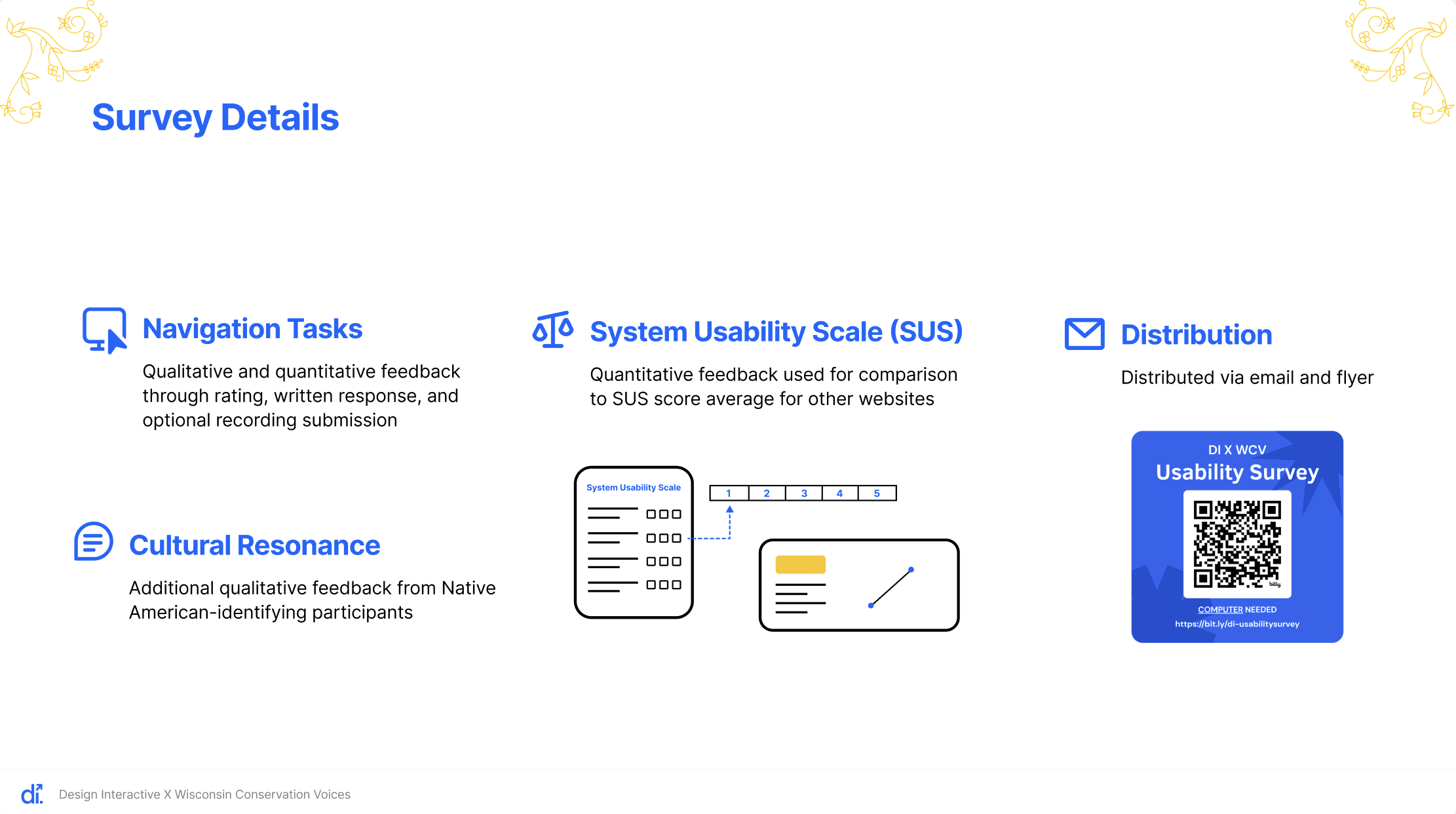
We used an online usability survey that randomly assigned participants to either the current website or our prototype. This allowed us to compare feedback on both versions’ Native Vote and Voting Info pages.
The survey included:
Navigation tasks (with optional screen recording), where participants completed a task, rated the experience numerically, and provided written feedback. This helped us understand overall navigation and ease of use.
System Usability Scale (SUS) questions, which measured participants’ overall satisfaction and perceived usability.
Cultural resonance questions, which explored how Native American participants connected with the site’s messaging and visuals.
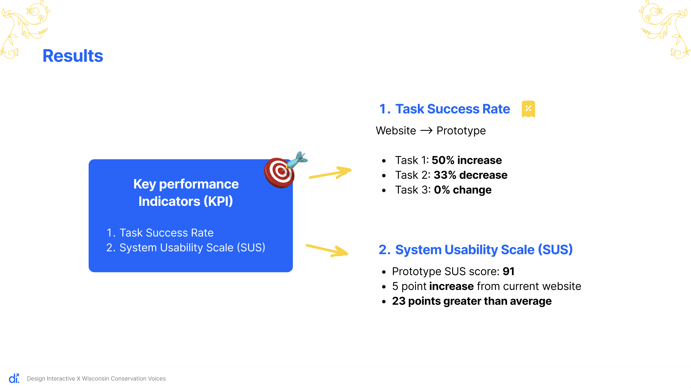
Our key performance indicators included task success rates and SUS scores.
From the current website feedback, two major themes emerged:
Text was often too dense, making information hard to find
Light text on certain backgrounds was difficult to read
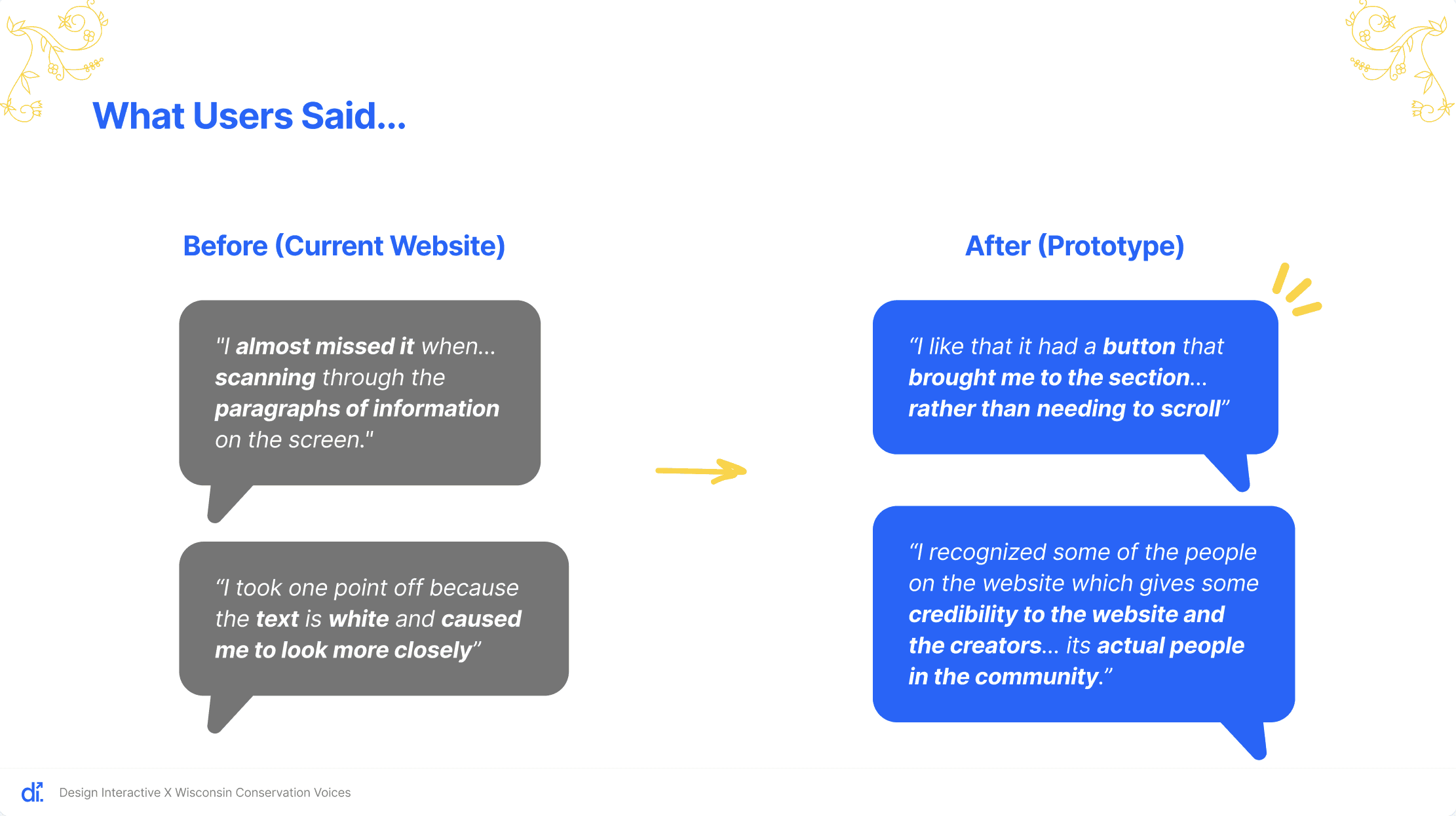
We addressed these issues in the prototype by:
Adding accordions to reduce text overload
Increasing color contrast to meet WCAG accessibility standards
As a result, these concerns no longer appeared in prototype feedback. Additionally, a Native American participant noted that the prototype’s imagery felt more credible, suggesting the design helped build trust and connection.
Implementation & Next Steps
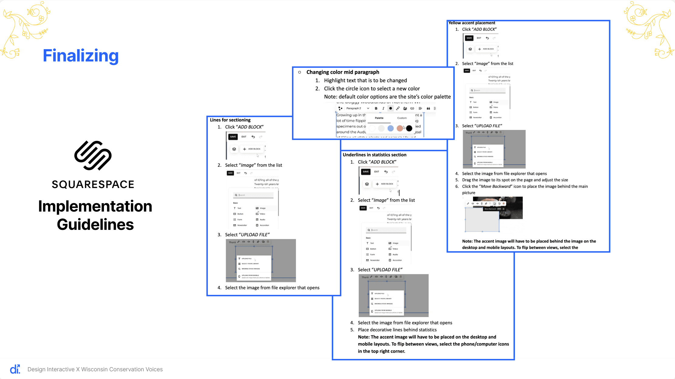
Overall, our design changes had a positive impact, though there is still room for improvement. To ensure smooth implementation, we tested each component in Squarespace and created step-by-step implementation guidelines in our final report to maintain consistency and branding.
Based on our final testing, we recommend:
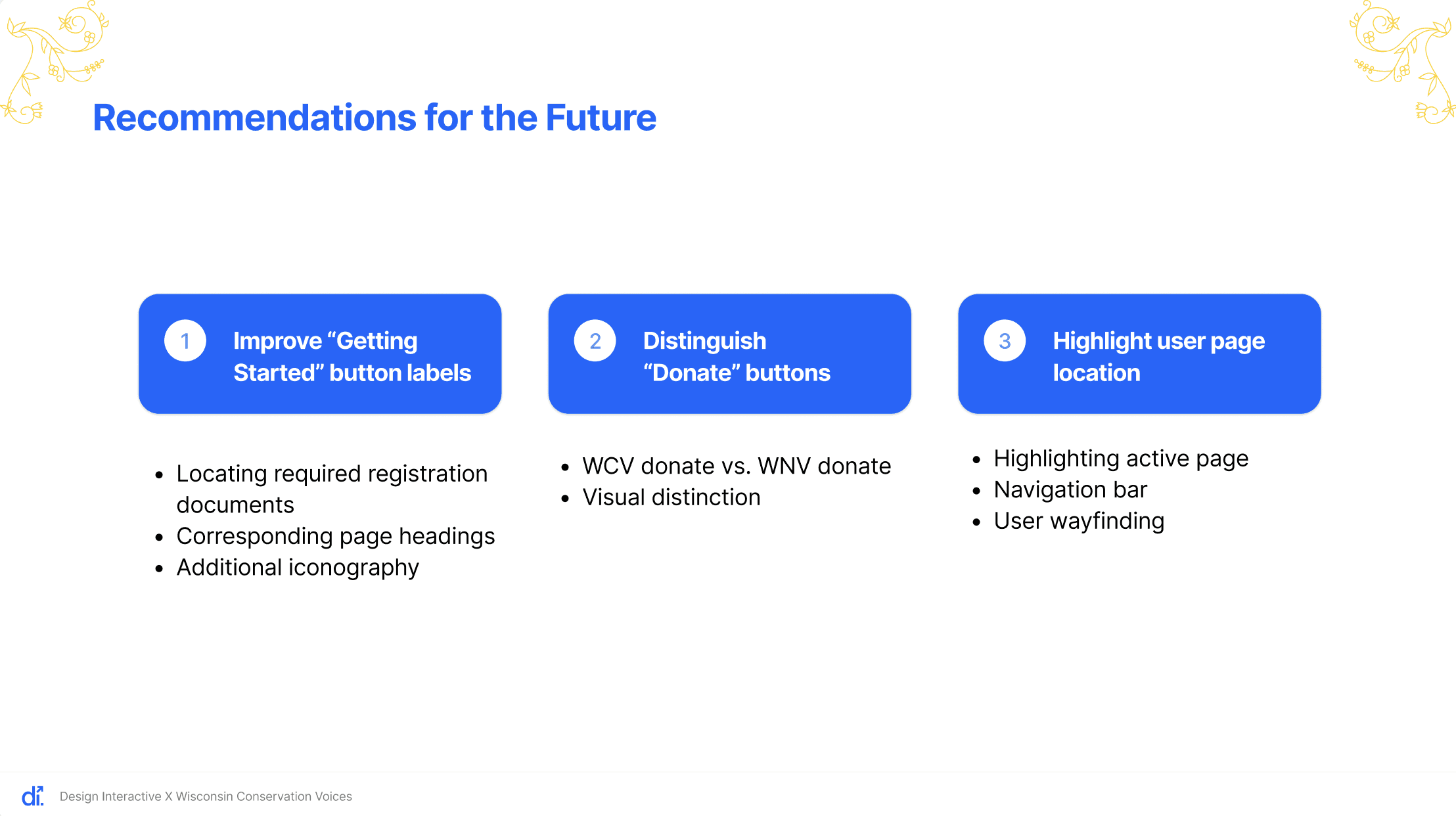
Refining button labels in the “Getting Started” section to better match page headings
Adding intuitive iconography to help users quickly identify button purposes
Making the Wisconsin Native Vote Donate button more visually distinct from the general WCV Donate button
Highlighting the active page in the navigation bar to improve wayfinding
To further explore these improvements, we recommend conducting 1-on-1 usability tests for more detailed and targeted feedback.